The client : Leyton
Founded in 1997, Leyton has grown to become an international consulting firm dedicated to improving its clients' overall performance. Its expertise is built around three business lines: innovation financing, energy and consulting and outsourcing.
A specialist in the management and financing of innovation, Leyton analyzes companies' R&D activity and advises them on possible financing (CIR, grants and subsidies, monetization of receivables, fund raising, etc.).
Present in 10 countries (France, United Kingdom, Belgium, Canada, Spain, Morocco, Italy and the Netherlands, USA and Poland), the Leyton group has more than 950 employees of 20 different nationalities. It has a portfolio of more than 8,000 clients. The Leyton Group also relies on an international network that brings together partners with specific know-how: legal expertise through the law firm Onelaw (in France) and Leyton Legal (in the United Kingdom) and a consulting offer dedicated to the public and healthcare sectors through the law firm CTR.
The problem: rethinking the display of key data and access to numerous functionalities of a B2B application.
Energy Saving Certificates (ECCs) are a powerful tool for financing investments. ECCs are a means of rewarding the efforts of energy consumers to promote sustainable development and energy efficiency.
To better advise and support its customers, Leyton has developed a web application dedicated to its B2B customers that is able to :
- to inform them in a personalised way of the progress of their activity via a follow-up of their file (in the field of European certificates, building sites, works...) ;
- to exchange with professional interlocutors of the brand via a complete messaging system ;
- to have an analytical dashboard (my files, my operations, my invoices);
- to be able to formulate requests for quotes,
- to carry out online calculations of possible energy savings in the form of step-by-step questions and answers.
The interface required real ergonomic and design thinking, in particular because it was intended for use on a variety of devices: desktop (PC/Mac/Linux), tablets or even smartphones, which are - as we know - increasingly popular for this type of consultation, including in the B2B field.
It was therefore a global analysis of the current application and a graphical redesign of the user interface that made up the mission entrusted to Naes.
The Naes solution: a dynamic dashboard, reorganized information, a better human presence
Rethinking an interface is not an easy task and is a real challenge and a great involvement. Indeed, it is first necessary to take hold of the tool in its smallest details, and put the real questions on the table: what do users expect, what are they looking for, what will they have in daily use and how to make them come back regularly?
Limiting conceptualization to what the data or technique can do can often miss the point. The application is certainly usable, but it has never weighed on a questionable ergonomics where each page differs from the other, where it is impossible to get the clearest and most immediate information possible, how to contact one's advisor, etc.
A central dashboard
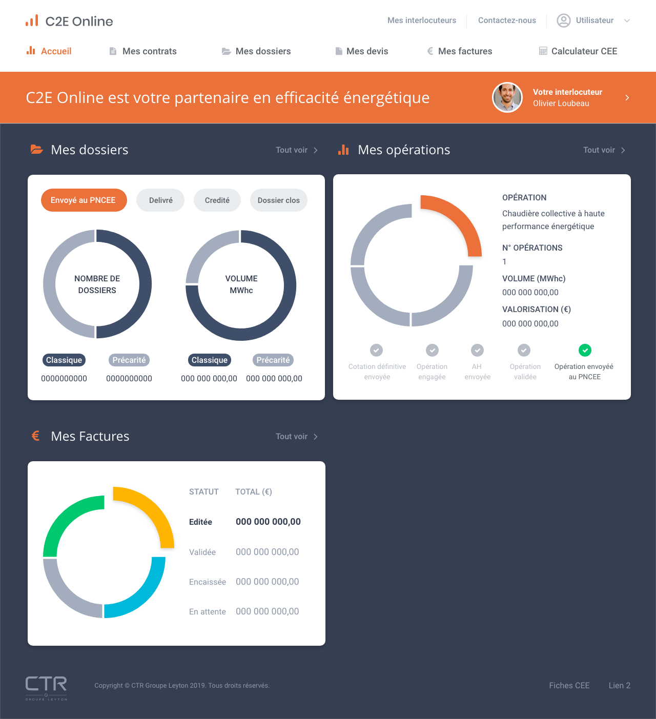
In collaboration with the Leyton teams, it has been possible to synthesize a large amount of information on a single screen able to offer a simple and pleasant view: volume of open files and their progress status, amount of energy saved, type of data provided, list of all operations and their status, detailed information provided interactively, invoices and their status, etc.
c2eonline_dashboard.png

Harmonized and structured screen themes
We have therefore reorganized all the screens and the main themes in order to make navigation throughout the application more fluid. All the data tables have been standardized and adapted to the particularly restrictive display contexts on mobile phones, for example.
We redesigned the navigation menu by reworking it on two levels: one grouping access to the messaging system, customer contacts and user account, and the other grouping contracts, files, quotes, invoices and a simulator.
A better place given to the human bond
By highlighting the customer's main contact person with the possibility of immediate contact through a redesigned messaging system throughout the user's journey, a strong relational positioning is affirmed. The customer feels better supported and knows that he can get answers to his questions at any time.
Gains over the long term
An application thought in its interface allows many gains:
- it increases membership and thus the daily use of the services offered ;
- it facilitates exchanges and, in this case, requests for additional quotes ;
- it can be used in the general communication of the services offered, as well as serving as a flag-bearer